Monday, July 30, 2012

Month 7: Applied Design Tools and Interfaces

Lab 6 and 7: Get Away Travel Wireframes

After we finished the Acme Movie Reviews website, we moved onto the Get Away Travels site. Since I've already explained the process with some of this stuff, I'll just post the wireframes here.

However... Here's a little bit of a look into the "real life" at Full Sail. Being a Full Sail student, I'm naturally broke. I haven't been able to pay my cable bill for two months now, and in the middle of this month my internet cut out. There's no knowing when I'll be able to get it back, either. So. I'm a web student without internet. We'll see how this goes... I'm updating my blog from class. But, here it is!


Saturday, July 28, 2012

Month 7: Applied Design Tools and Interfaces

Labs 4 and 5: Acme Movie Reviews Composition

Once the high-fidelity wireframes were finished for the ACME movie reviews website, we continued to do compositions for the four pages we did wireframes for. Before we began our compositions, however, we had to do a style tile, which is a great document I would recommend as a deliverable for clients. You can get a free download here:
http://styletil.es/

The Style Tile includes examples of primary, secondary and copy text as well as global navigation, textures and color palettes. After I finished that, I moved on to my comps:


Tuesday, July 10, 2012

Month 7: Advanced Design Tools and Interfaces

Lab 2: Acme Movie Reviews - Designing for Task Based Workflows

For both Labs two and three we're working on high-fidelity wireframes for a fictional movie review website. Included is the home page and the genre listing page. (Next class are three additional wireframes.) Utilizing design patterns, principles and elements, I've created a composition that I feel is quite unique compared to sites like IMDb, Fandango, Rotten Tomatoes and Movie Tickets. Let me know if you have any suggestions. I love feedback like zombies love brains! Hmm. That gives me an idea for a painting...


Month 7: Advanced Design Tools and Interfaces

Lab 1: Principle and Elements of Design

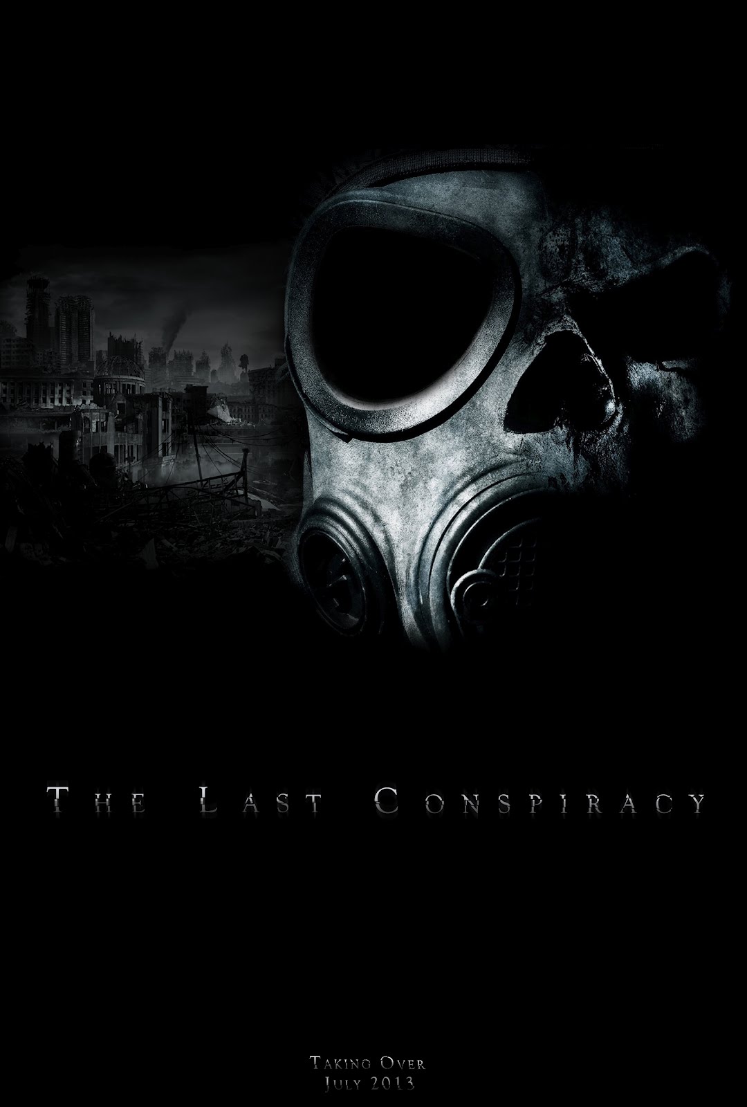
For this lab we were told to create a design for print. It had to encompass at least two Principles of Design. I chose emphasis and contrast. They were easy design principles, and though I don't like to take the easy way out, it just fit my design really well. Additionally, we had to create another document with color swatches featuring their RGB and CMYK color values. This lab was really easy, but incredibly fun. It's the first lab where you can do anything you want. The only requirement is that it has to be something that will be printed and it also had to use two images. I found the skully gas mask off of Google. Now that I think about it, I probably should have made my own. Perhaps it calls for a bit of a redemption. Anyhow...

The design itself is based off an idea that I had for a movie, surrounding the Denver International Airport conspiracies. Do I believe them, myself? No. But I think they'd make for a fantastic Horror / Suspense / End of the World Doomsday movie.

Tuesday, June 26, 2012

Helpful Web Design and Development Links

Hello everyone! I'll be updating this as frequently as possible. This list is a compilation of any media that I've found would be a great help to any web designer or developer out there. As I go through more classes, I will continue to update this with specific links. Thanks for reading!

Everything to Know About the DMCA
www.chillingeffects.org"

Know Your Online Rights as an Artist
www.rightsforartists.com

Licensing for Your Online Work
www.creativecommons.org

Great Place to Host and Share PDF's
www.scribd.com

Adobe's Builder for Phone Gap
build.phonegap.com

Adobe's Debugger for Phone Gap
debug.phonegap.com

Backbone Directory for Phone Gap
www.github.com/ccoenraets/backbone-directory

Web Measurements
www.960.gs

Month 6: Web Interface and Usability

Hey there everyone. I'm finally able to post this. Last month was extremely work-intensive. I feel sorry for the people who had two classes. Thankfully, I only had one. I would recommend that you talk to your Student Advisor before taking this class and take it by itself if you truly want to produce something really nice.

That being said, I had Erin instead of Chris Burke this month. It was a fun class, and she really goes out of her way to help the students. She offers study groups for the midterm and the final, and even brings prizes.

I got really lucky. ESPN contacted Full Sail and as students, we got a chance to get real world experience. I put everything into my wireframes and I believe I get to continue working on them in the next class, too.

Lab 1: Good and Bad Design
This lab is by far the easiest lab. You spend the lab walking around campus, taking pictures of what you think is good and bad design. Then you're handed a worksheet that ask you to describe certain usability principles within each design.

Lab 2: Design an Elevator Panel
This lab was also fairly simple, though it required a little bit of thinking outside of the box. You needed to design an elevator that could go up (and down) 1,000 floors, including ways to add and delete floors to (and from, respectively) a queue.


Lab 3: Flow Chart:
In this lab we were required to make a flow chart. It's a technical document that describes the layout of the site. This was fairly interesting, because we were required to go as far down as a page element, which is uncommon. Most flow charts only go down to a single page. You can reference the site diagram that I did in Principles of Production process in an earlier month.

Lab 4 - 7: ESPN KAM Project
The ESPN KAM project spanned the last four labs in the Web Interface and Usability. These labs will not be the same when you go through, but the principles are there. We had to wireframe a Kiosk application for ESPN to collect data through interviews.

After many hours of tedious wireframing, I finally completed my click-through prototype and you can view it here. If you would like to comment or critique it, please send me an email. I'd love to hear your thoughts on my design.

http://invis.io/N740BZ8E

Thursday, June 14, 2012

Month 6: Web Interface and Usability

Hey there everyone. I apologize for not keeping up with my posts as often as I should. This class has been extremely demanding. Some of the experiences I've had are hard. For those of you who are considering going to Full Sail, you would have Web Interface and Usability paired with another class, Networking and Server Structures. About two weeks ago, when we had our midterm, we were assigned a project for Web Interface and Usability (on Tuesday) and also were given a reading assignment (one hundred pages!). On top of that, Wednesday, there was a study group for two hours, you were expected to study for the test, and other people who had NSS still had to attend class on Wednesday for a full eight hours.

I ended up getting all my work done, though. I'll post it up on here as soon as I can. Another project that we will be doing next Tuesday will include a click-through wireframe, so you can see for yourself what this class has ultimately taught me. I'm going to wrap up this post, because class will be starting soon, however I'll go ahead and throw up that poll for you guys.

Thanks for reading! :)