Project 1: The Layout
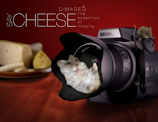
Now that the camera is finished, we were supposed to do a layout. One thing I will comment about in this post is the lack of communication between the course directors and the lab staff. Our teacher told us she wanted four thumbnails of our layouts. The lab staff required us to do seven different concepts, and then five layouts of the "chosen" one. I'm not complaining, I'm just pointing out a situation. I might be an exception, but I know a lot of other students get quite frustrated with the whole ordeal. If it wasn't for the extra thumbnails, I wouldn't have come up with the idea I used for my layout. I was originally going to do an ad based on time travel, but "Say Cheese" just seemed so much better. Basically I took my camera from Illustrator and imported it into Photoshop. I grabbed a couple of random images and did a LOT of editing to get them the way I wanted. Overall, I feel like the typography (while simple) is actually very effective. It supports the simplicity of the ad. The graphic combined with the type illustrates a cute concept that everyone is familiar with. Hip-hip-horr"A"!
Tuesday, February 7, 2012
Subscribe to:
Post Comments (Atom)

0 comments:
Post a Comment